Omen
Brewing
A logo and brand redesign made for Omen Brewing as part of a branding project at MacEwan University.
Reviewing the disconnect between a current brand approach and voice, contrasted to other local brands within the same market that achieve a stronger unity in voice and vision. Aiming to develop a result that better aligns with their current market demographic, enhancing the brand’s image.

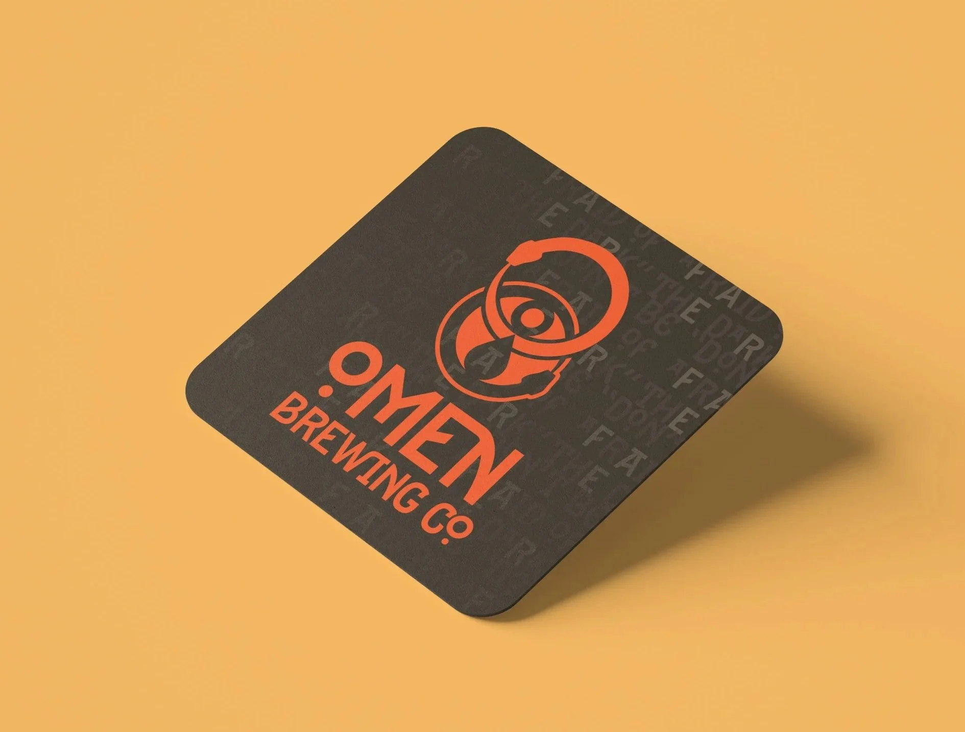
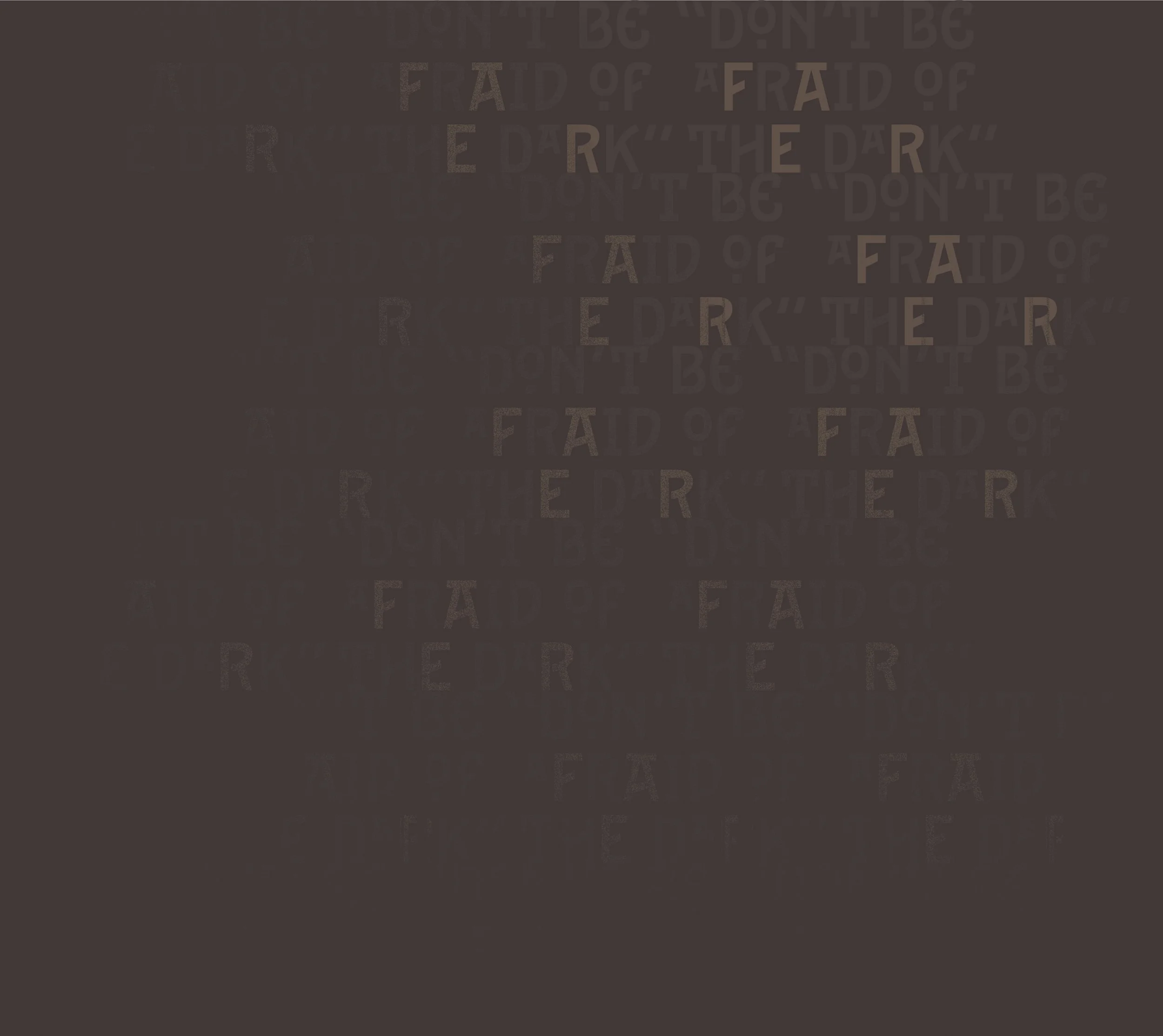
Don't Be Afraid Of The Dark
Don't Be Afraid Of The Dark
Current Brand Design
A family-owned, local company, established in 2020, targeting a craft beer market niche, specializing in dark beer enthusiasts and extending to the local community of outdoorsy patio goers seeking to establish a fun and family-friendly atmosphere.
-
The current brand is featuring a palette that doesn’t carry through the current identity desired, leaving room for refinement.
-
The packaging labels vary in style, ranging from detailed photo overlays and geometric illustrations, which require a more unified company voice and vision to create packaging that feels consistent and stands out from competitors.
-
The dark tone, themes, and vision on their web platform, highlighted by the tagline ‘Dark Beer Worth Crying Over’, do not currently carry over to the visual system across other regions of the brand beyond the web.
The Re-Design
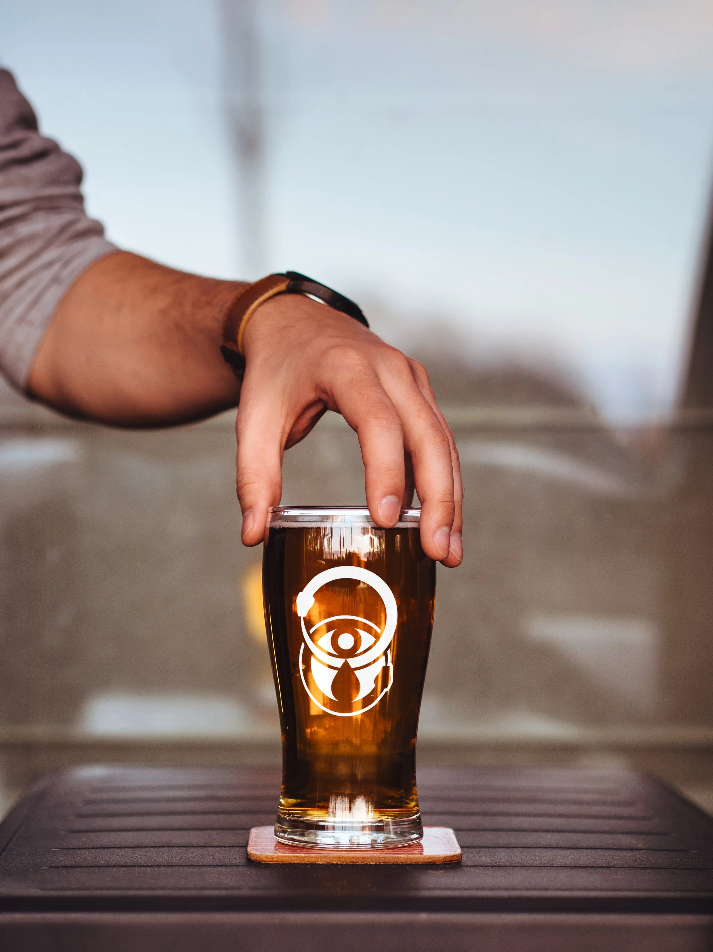
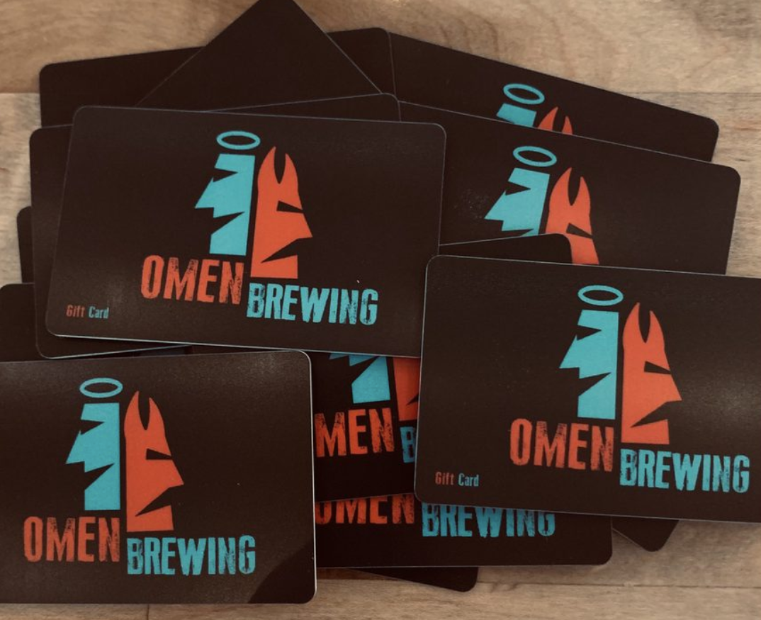
Primary Logo
Secondary Emblem and Stacked
Utilizing symbolic referencing to tie in the brand’s niche within the market, alongside a custom variation of the Epitaph typeface for a unique touch built just for the brand.
Voice, Vision, and Story
-
Perception beyond the ordinary.
Giving attention and focus to the craft. -
Ancient representation for unity and the natural elemental cycle of destruction and re-creation. Enhancing the edge of the vision, leaning into the dark themes as a cohesive pull unifying the foundation of the brand.
-
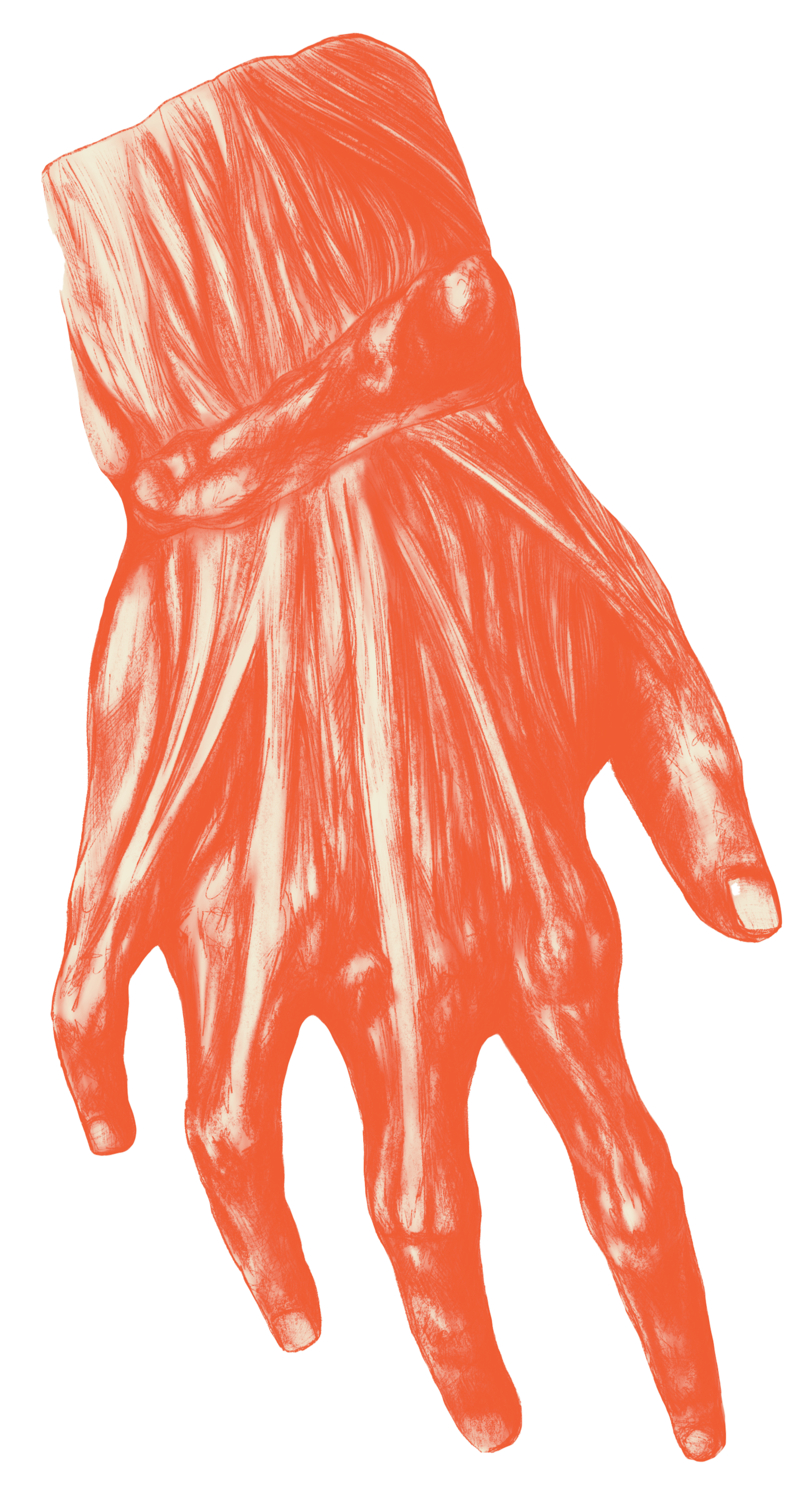
Leaning into the idea of Dark Beer Worth Crying Over.
The encased tear ties into the values that we simply won’t waste a single drop in providing the best dark beer around. -
Originally created during the Arts & Crafts era (1880-1920) as the common letterhead on tombstones, it has a checkered past and has gained new popularity.
Similar ties to this typeface carry over into the horror and supernatural genres, such as American Horror Story.
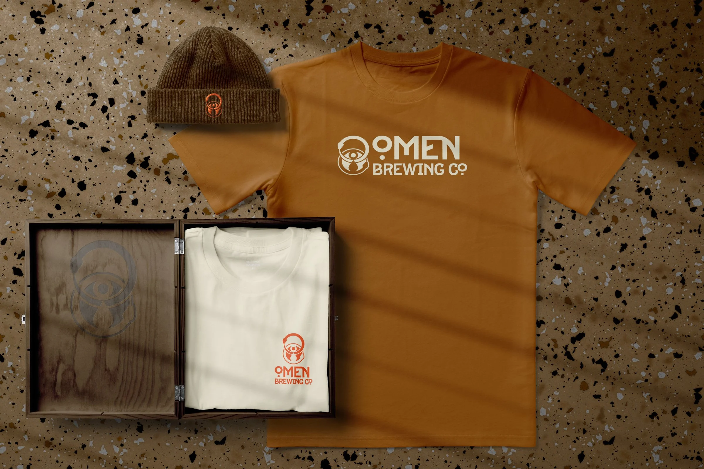
Collateral
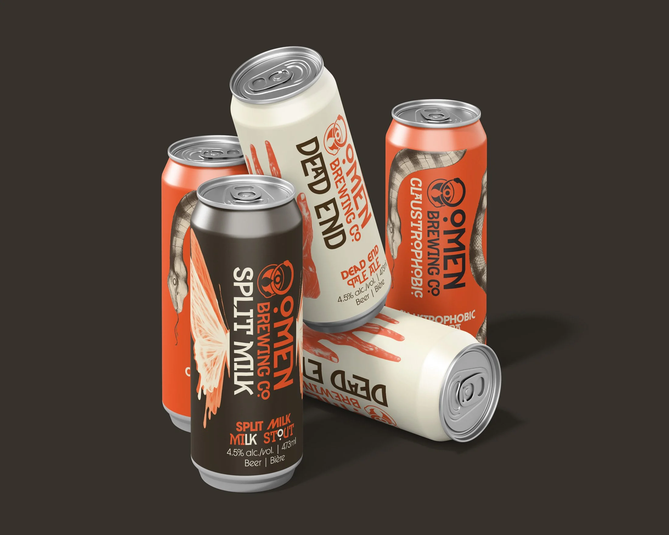

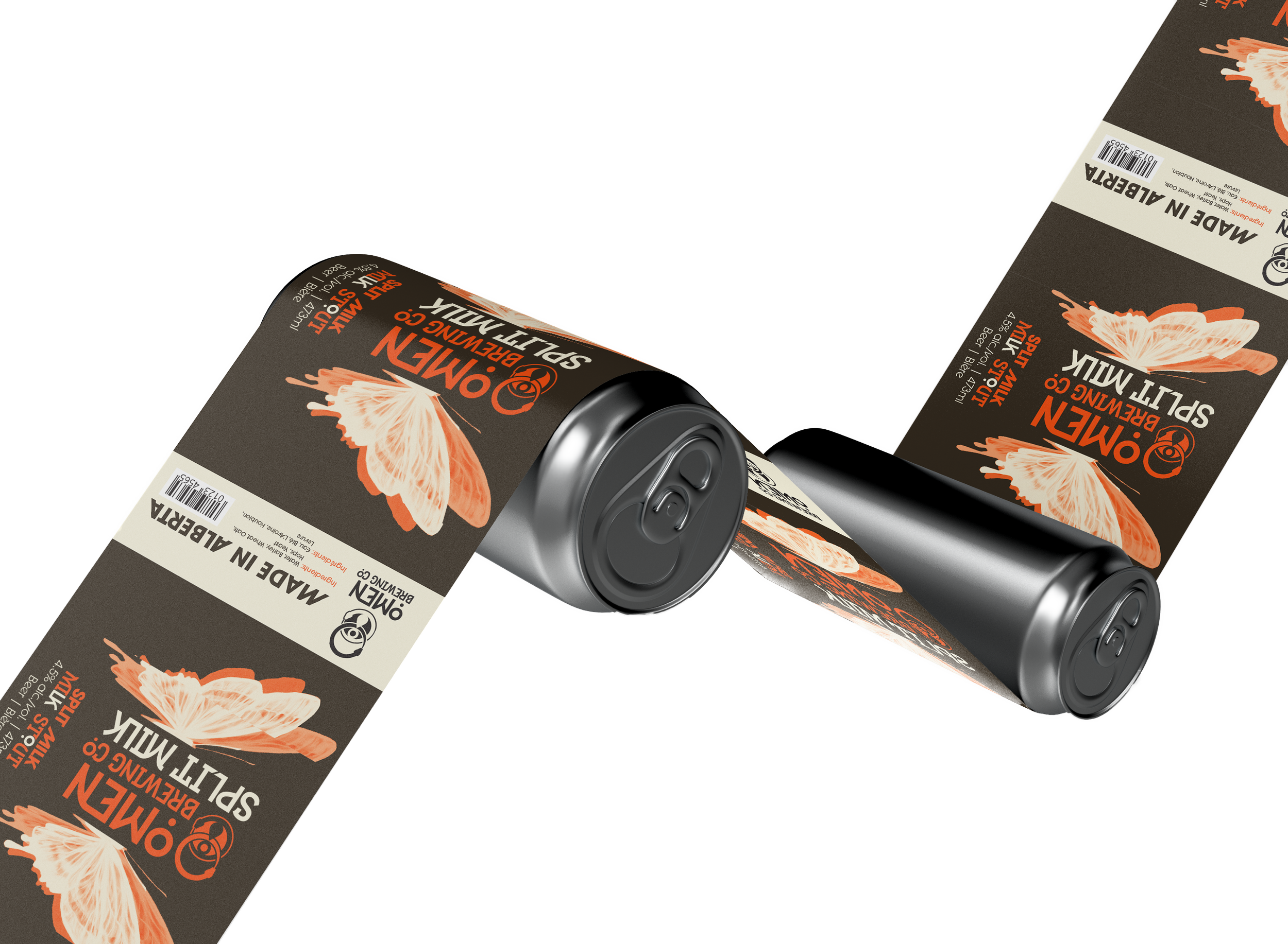
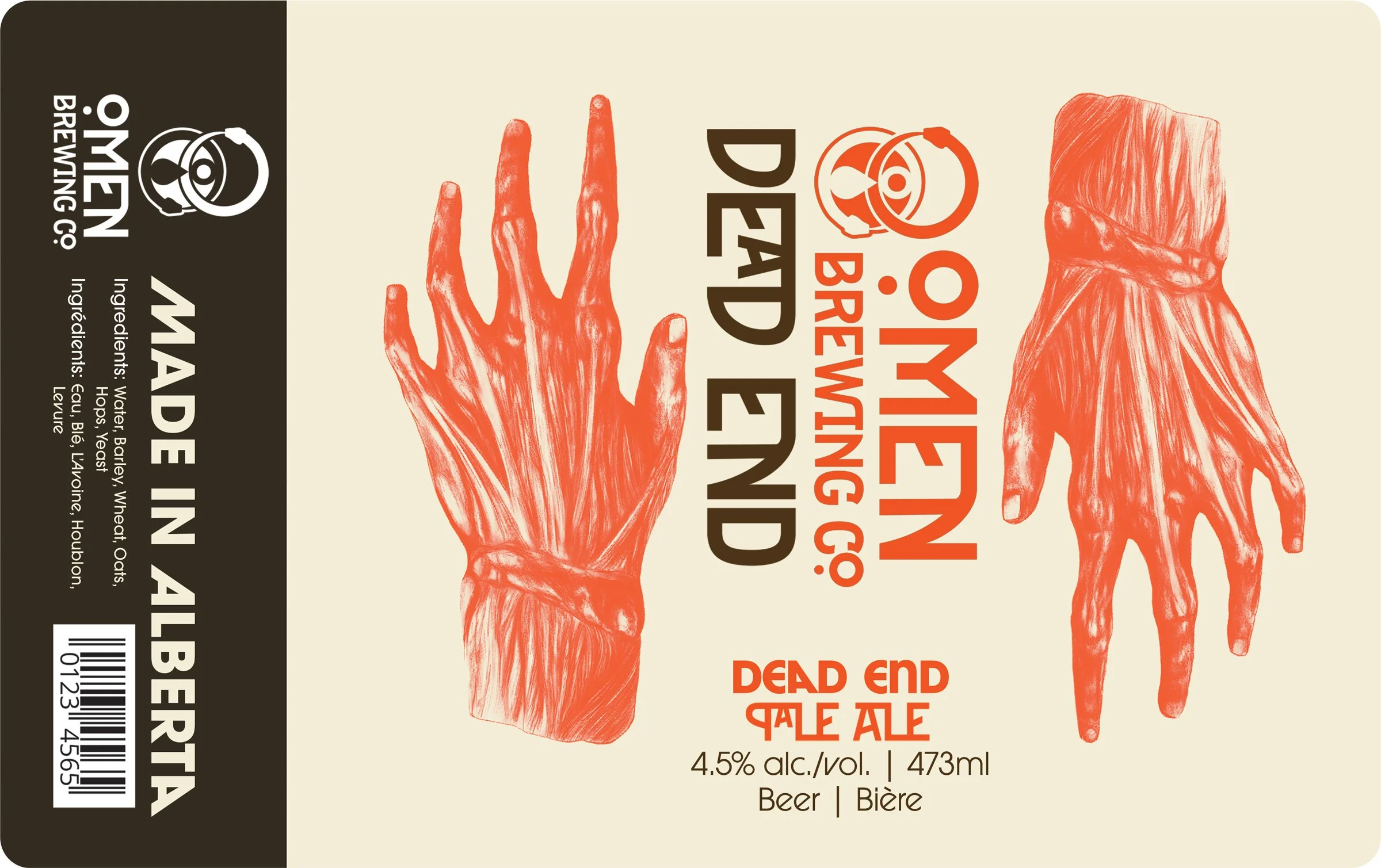
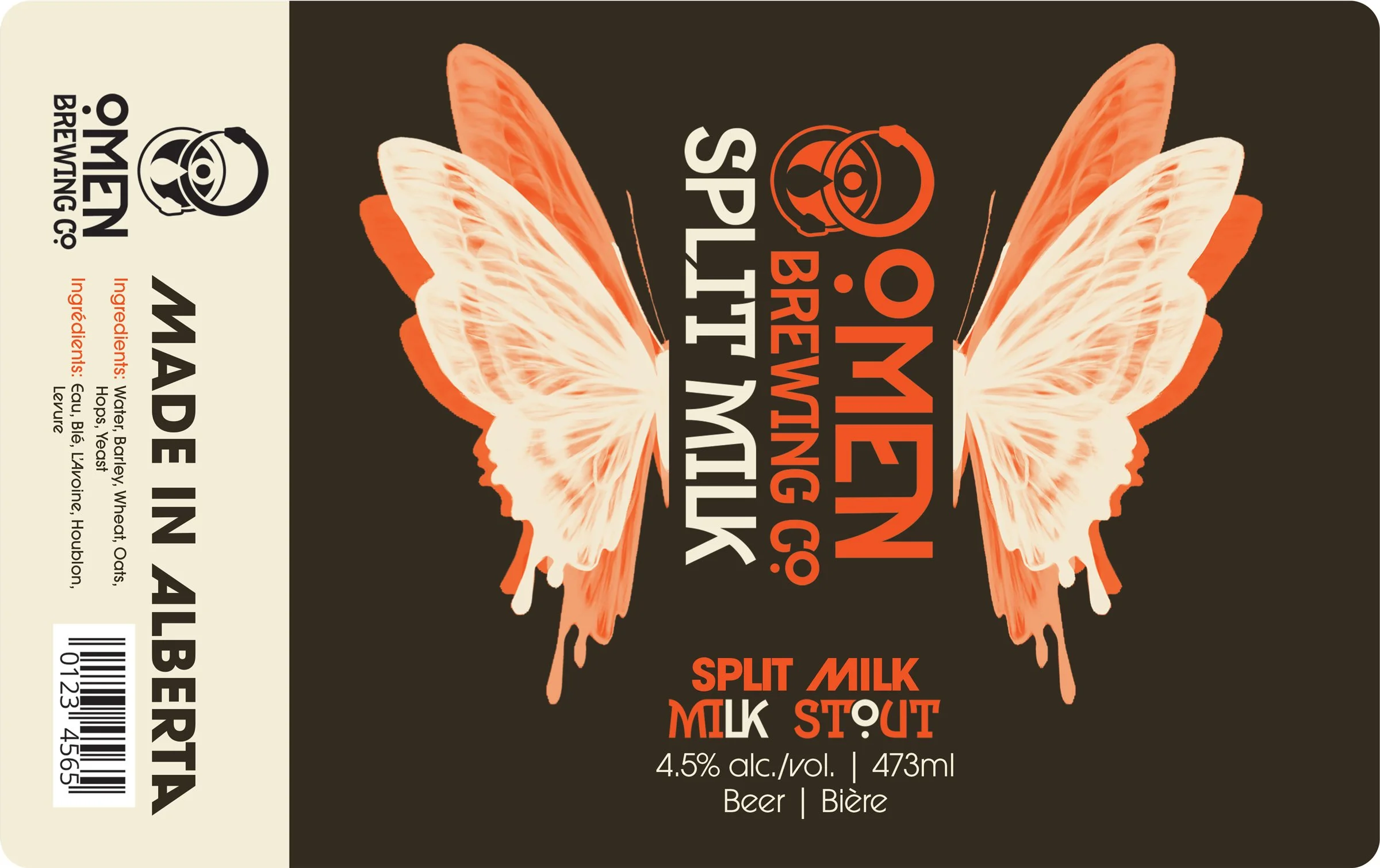
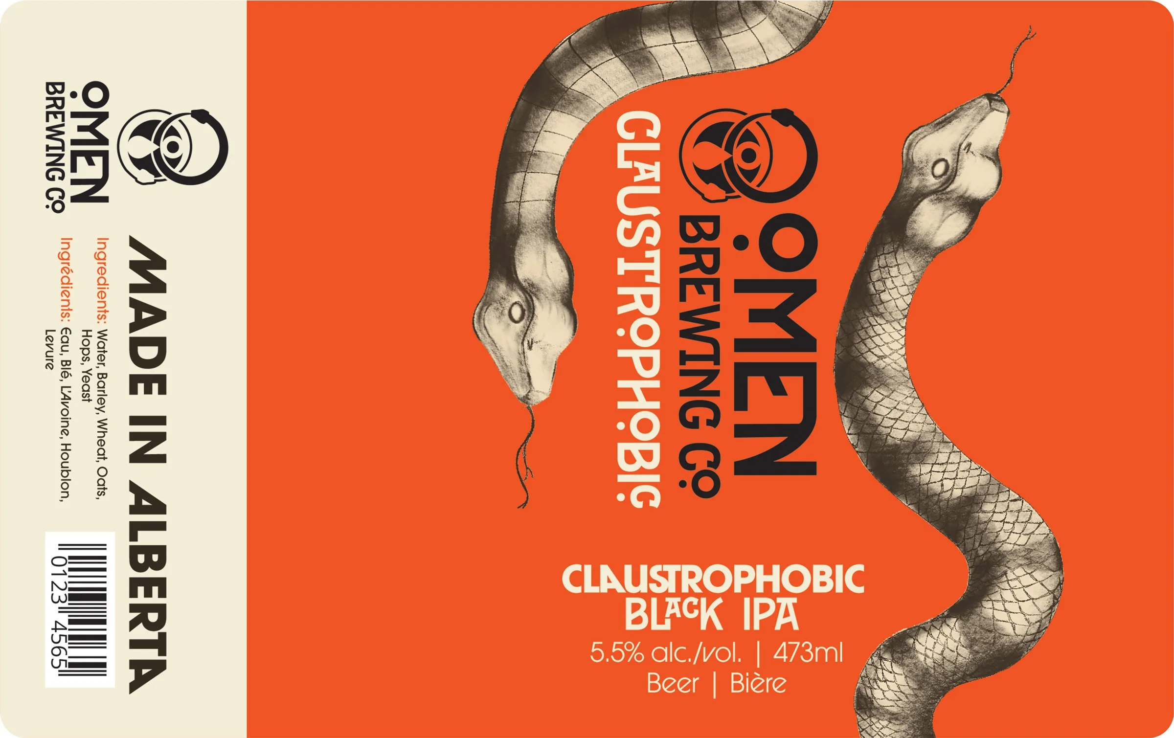
Unifying Beer Can Designs
Combining Rhythm through subtle hints of asymmetrical unity, framing the front view of the text, which blends the impact of customized text and product colouring to create unique markers for each can, while maintaining an overall unity recognizable within the branding.
Dead End | Pale Ale
〰️
Split Milk | Milk Stout
〰️
Claustrophobic | Black IPA
〰️
Dead End | Pale Ale 〰️ Split Milk | Milk Stout 〰️ Claustrophobic | Black IPA 〰️
Expanding Collateral
& Touchpoints
Developing collateral targeting both the market’s demographic styles and small touchpoints for interaction between the customer and the brand.